The Ergonomics of Computer Code
Computer code serves a dual purpose. It must be processed by a machine, but
also readable by a human. And preferrably not just the human who wrote it, but
any well-educated human.
In the Old Days (tm), programmers didn't need to think very much about how
their code would be displayed. In the 1970s (for the purpose of this
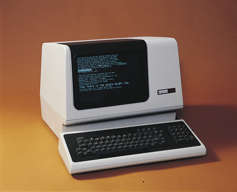
discussion, I'll assume history began with the UNIX Epoch), you usually had a
cathode-ray tube which could display two colors: black, and either green or
amber. To simplify the hardware, fonts were monospaced, meaning that each
character took up the same amount of horizontal space on the screen. Line
lengths varied between 40 and 80 characters.
Programmers didn't have to worry about which colors to use to display code.
The hardware designers made that choice for them when they selected the
phosphors used in the monitor. The idea of writing code with more than 80
column line lengths was obviously bad, because the monitor would have to wrap
the text.
Of course, we don't labor under these constraints today. Big monitors are
cheap: on
amazon.com, I can order up a
32-inch monitor for around $400. Even at 75 dots per inch, that huge monitor
could display a gigantic line length. And of course, so-called "retina"
displays can display somewhere north of 200 dots per inch. Proportional-width
fonts have been technically feasible since at least the day of the original
Macintosh in 1984.
Despite all these technical advances, most programmers continue to use
monospaced text, displayed with a muted color scheme, with a line length of
somewhere between 80 and 100 characters. For example, the coding standard used
by
the Apache HTTP
server specifies that lines must not be longer than 80 columns. The
obvious question to ask is: are programmers using these standards because of
tradition, or because they're better?
Monospaced Fonts
Why use a monospaced font? Well, code often contains lots of punctuation
characters such as exclamation points, carats, dots, and so forth. In a
proportional-width font, these characters are often very narrow relative to the
other characters, making them easy to miss.
It's easy to align text when using a monospaced font, simply by adding spaces.
You also know that the spacing and line lengths will remain the same when
another developer views it with a slightly different monospaced font.
Line Length Limits
Why limit the length of lines? There are a few reasons.
Diffs
Consider this diff:
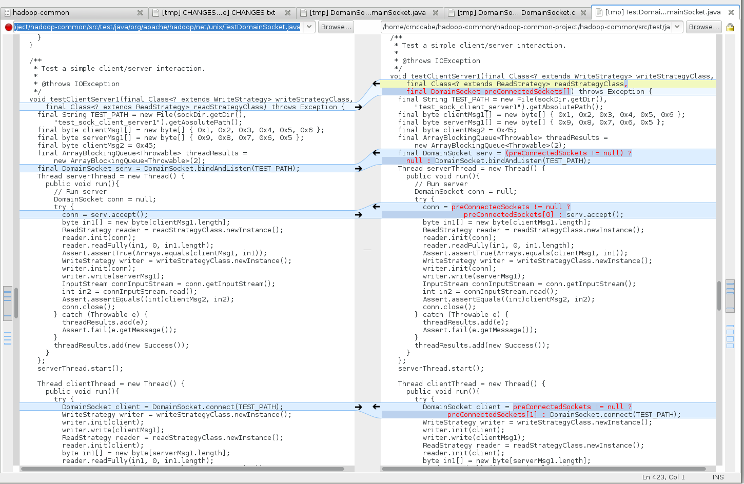
If we had line lengths that were hundreds of characters long, it wouldn't be
possible to display a diff like this, with the old version on the left and the
new version on the right. You could argue that with a really giant monitor we
could still do it, but in order to read such a stretched-out diff, your eyes
would have to go back and forth long distances, causing eyestrain.
Multiple Windows
It's helpful to be able to display multiple files on the screen at once. For
example, when you are moving a subroutine from one file to another, wouldn't it
be nice to be able to see both of them at once? Of course, even with long line
lengths, you could split the screen horizontally to accomplish this. But then
you've limited the amount of vertical context you can see. Even without any
line limits, there will always be short lines sprinkled throughout the source
code. Reducing the vertical context limits the amount of information you
can see at once.
Good Style
The more indentation your program uses, the more context a person reading it
has to keep in their head. Most programming languages allow code in a nested
scope to access things in enclosing scopes. For example, in Java, non-static
inner classes can access the variables of the enclosing classes. Since you
want to limit the cognitive burden on your readers, you generally want to limit
indentation.
Line length limits are a good way of limiting indentation. If it becomes
difficult to keep the code within a reasonable line length limit, that's
usually a red flag that your variable names are long and unwieldy, or that you
have nesting that is way too deep. In fact,
the Linux kernel
style guide uses 8-space tabs for indentation precisely to limit excessive
indentation.
Readability
When you are done reading one line, you have to find the beginning of the next
line. This is easy when lines are short, but becomes harder and harder as
lines get longer. There is a reason why newspapers and magazines still display
text in multiple columns!
Color schemes
Some programmers like to read light text on a dark background; others prefer
the reverse. As far as I can see, the main rationale for using a dark
background is that it allows you to look at something that is less bright. (I
remember one programmer described trying to read text on a white background as
"trying to read text printed on a lightbulb.")
Personally, I use a light grey background. I do this because so many other
applications I need to use on a daily basis, like my web browser, generally use
a light background as well. I find it jarring to move my eyes between a window
using a dark background and one using a light background.
I think it's important to note that you should
not use a bright white
background with black text. I have found that staring at high-contrast text
for hours on end tires out my eyes. That's why I always configure my terminal
to use a grey or off-white background. I wish that the upstream maintainers of
xterm and other software would make this the default.
Conclusion
Over the years, developers have created a set of conventions that make it
easier to read and understand computer code. Although it may seem tempting to
dismiss these as artifacts of the past, as long as human beings are at the
keyboard, these conventions are going to be a part of our future.